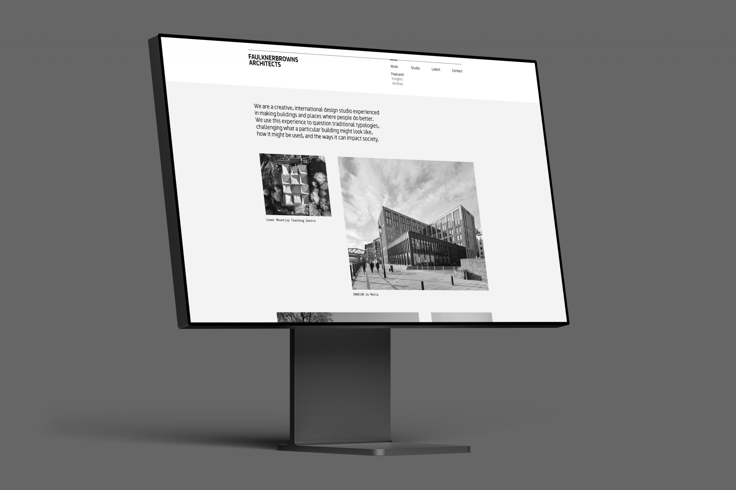
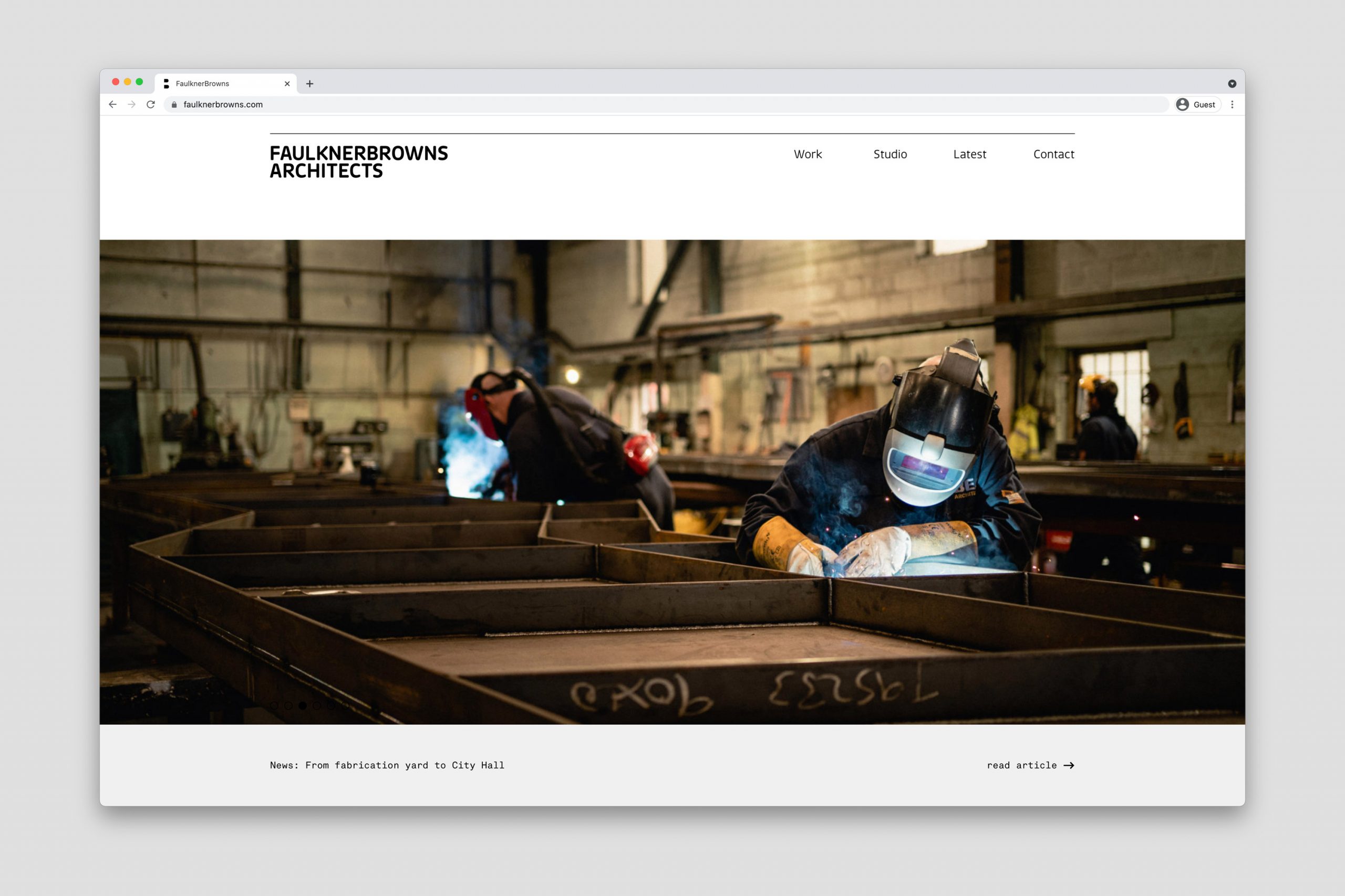

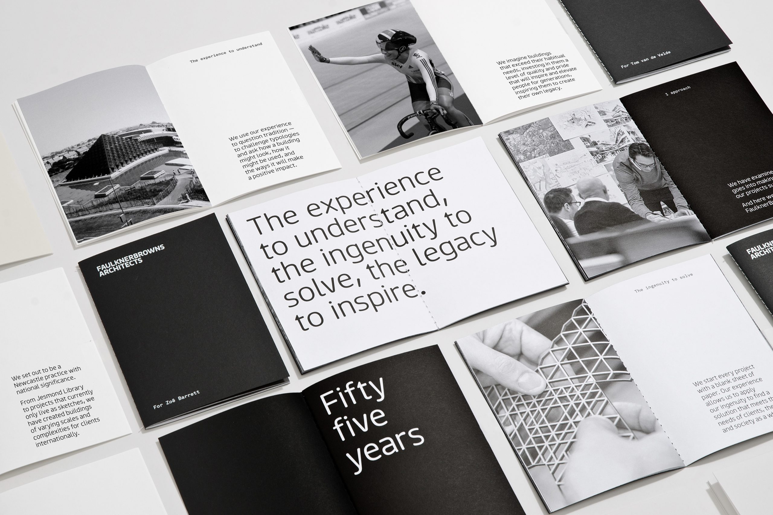
In 2016 FaulknerBrowns approached DNCO with a brief for a new website and brand refresh. Their existing brand identity was something of a modern classic, designed by A2/SW/HK back in 2007. We all agreed that the core elements of the brand must remain – the strict adherence to black & white, the custom FB typeface, and the interplay between the words and their negative space.
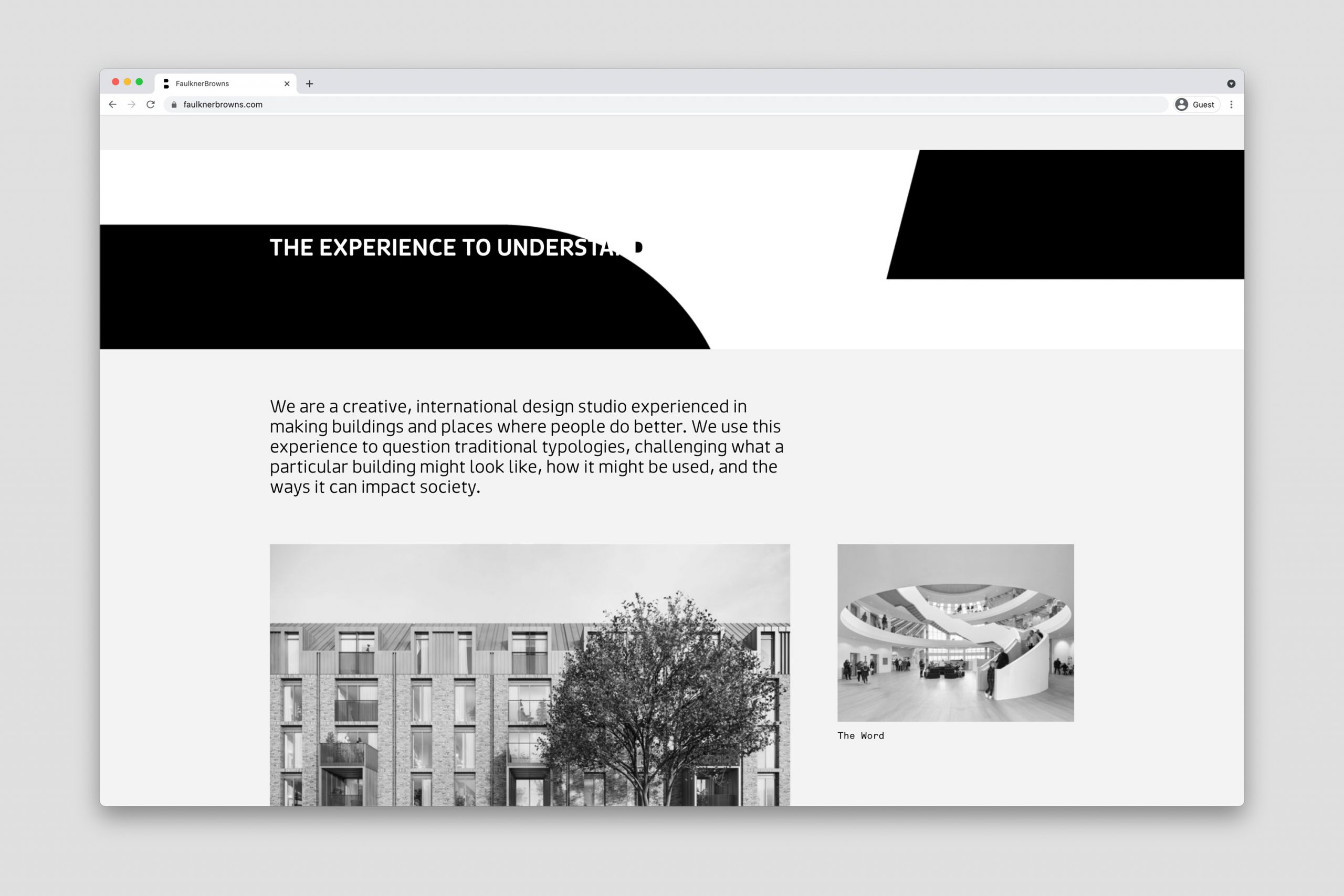
On the new website we brought the brand to life through motion and interaction. By ‘fixing’ simple black and white patterns in the background, words can be revealed as the letterforms and counters scroll over the top. We introduced a mono-spaced typeface to support the FB brand and lend a technical feeling to their aesthetic.
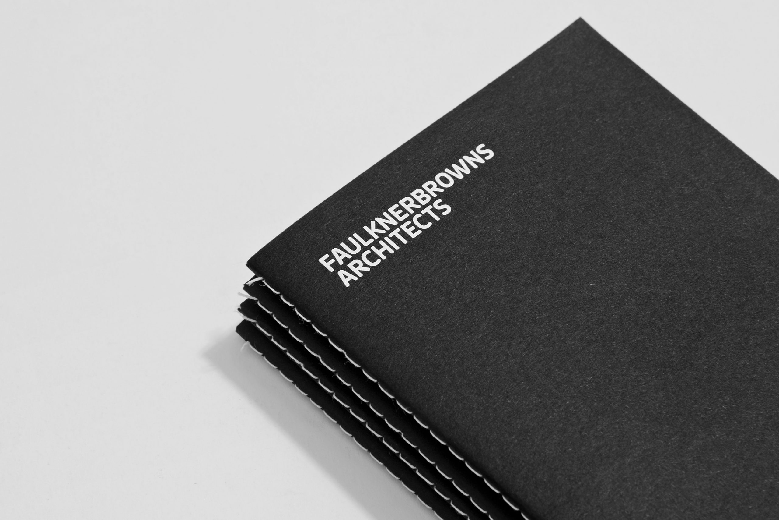
We also produced a 24-page A6 manifesto that was distributed amongst the team. The slip-case was die cut to bring the counters to life in a physical, tactile experience.