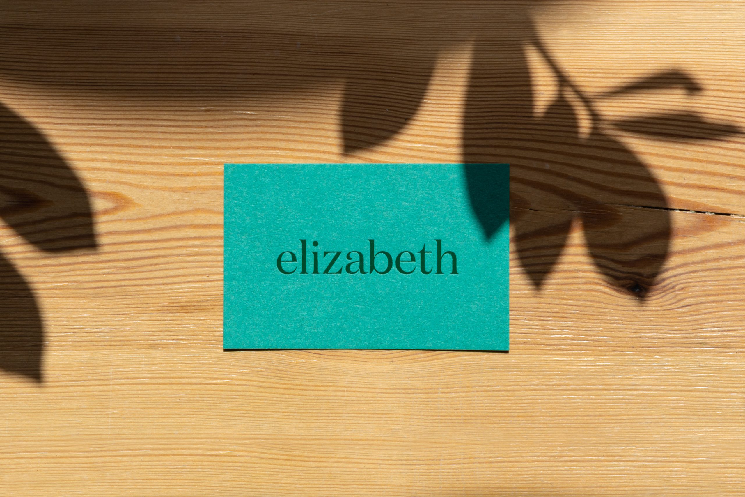
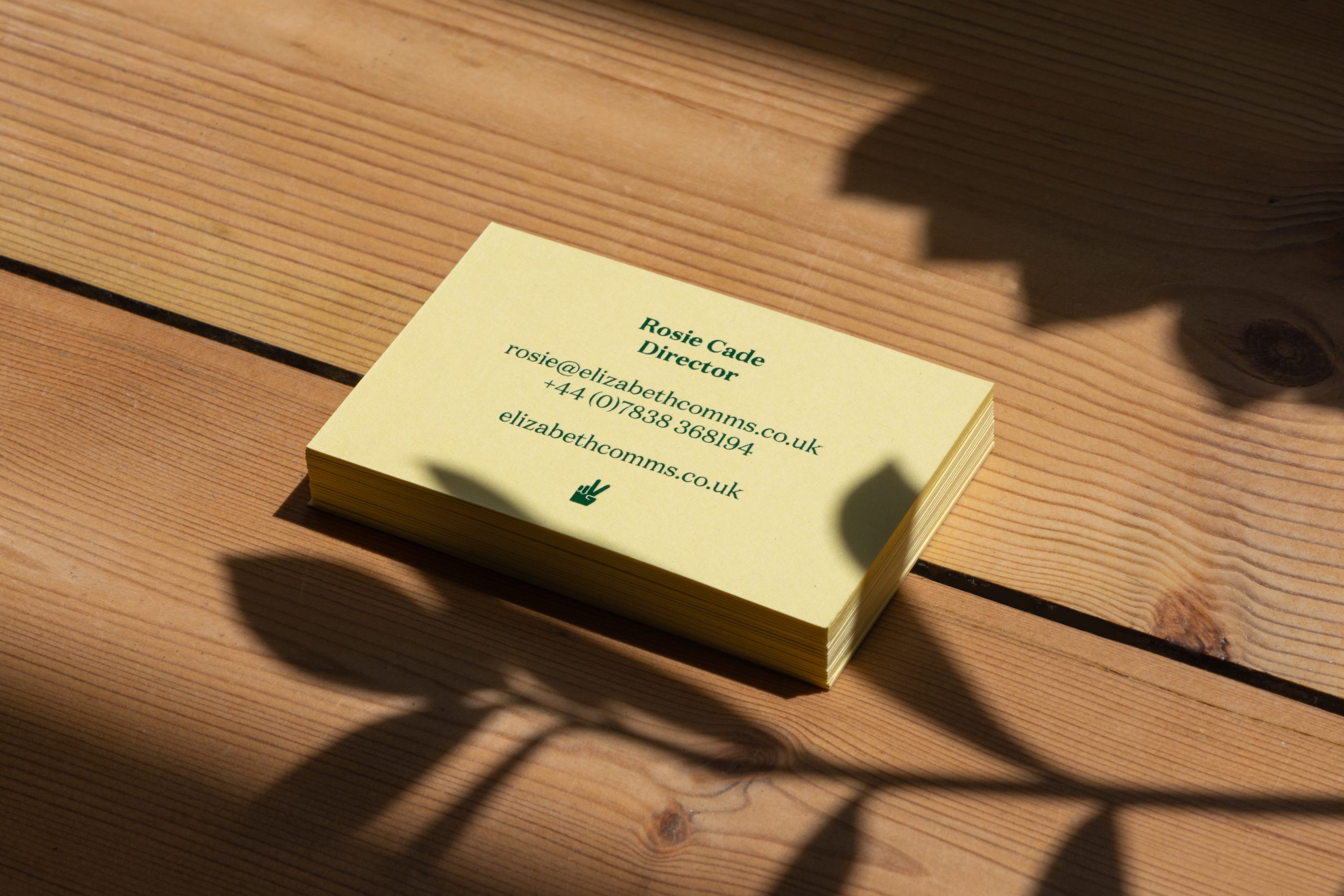
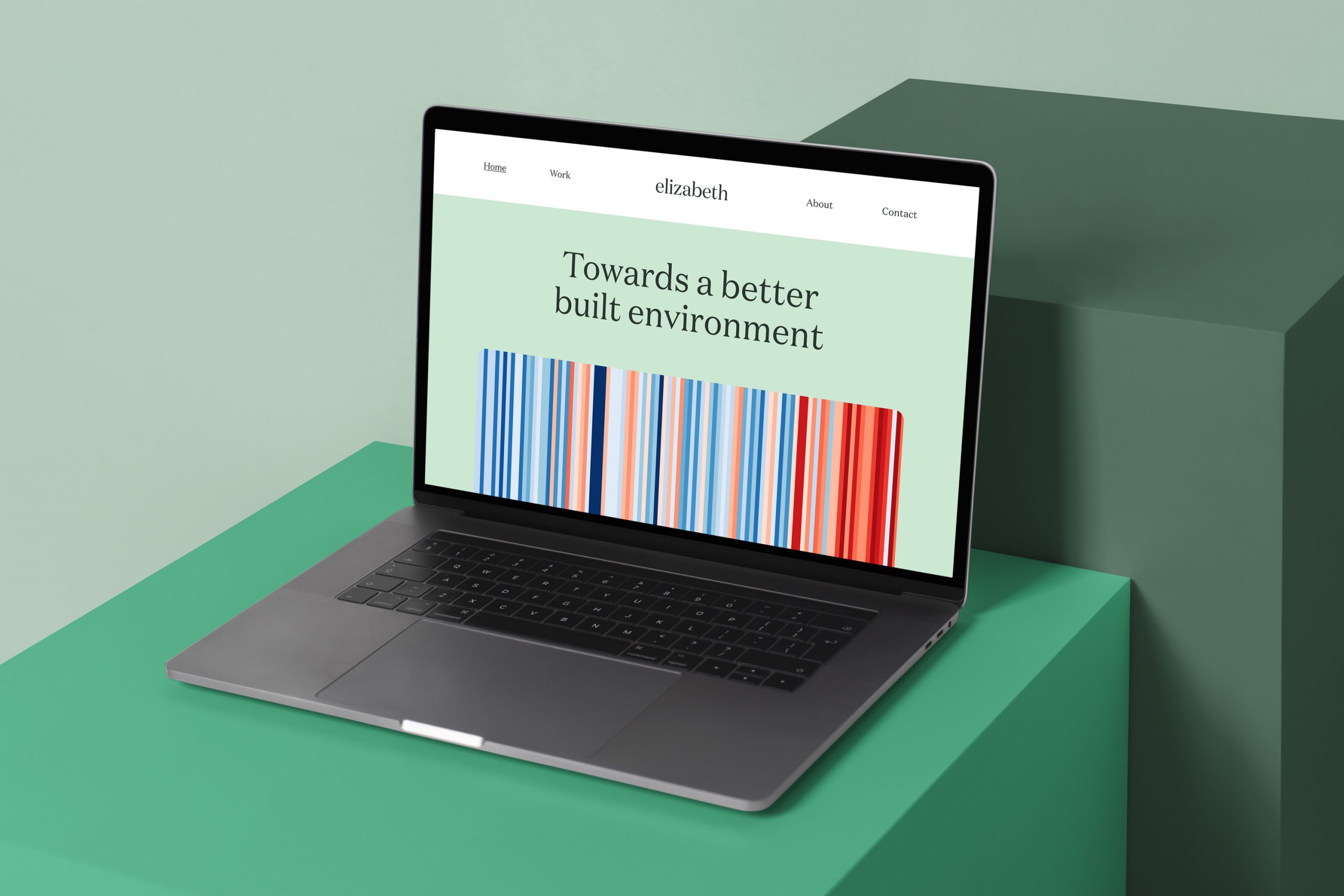
elizabeth is a specialist communications business fighting the climate emergency through change in the real estate sector.
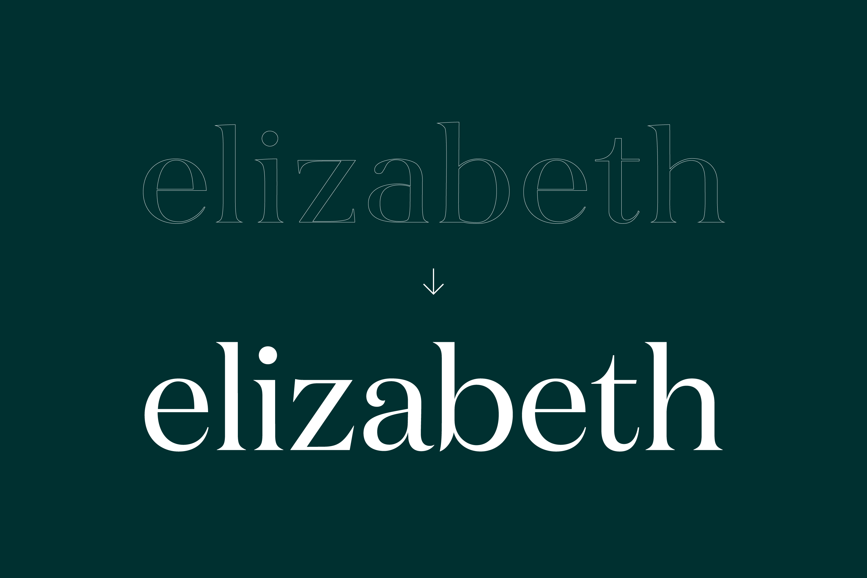
They approached me to refine their brand identity and to design a new website. The existing wordmark was working fine – set in a serif typeface, all lower-case. However, when really looking at the details, the typography had room for improvement. I proposed moving to the wonderfully-drawn Domaine by Klim Type Foundry.
Elegant business cards were foil blocked in dark green onto two different coloured stocks – emerald and sorbet yellow.