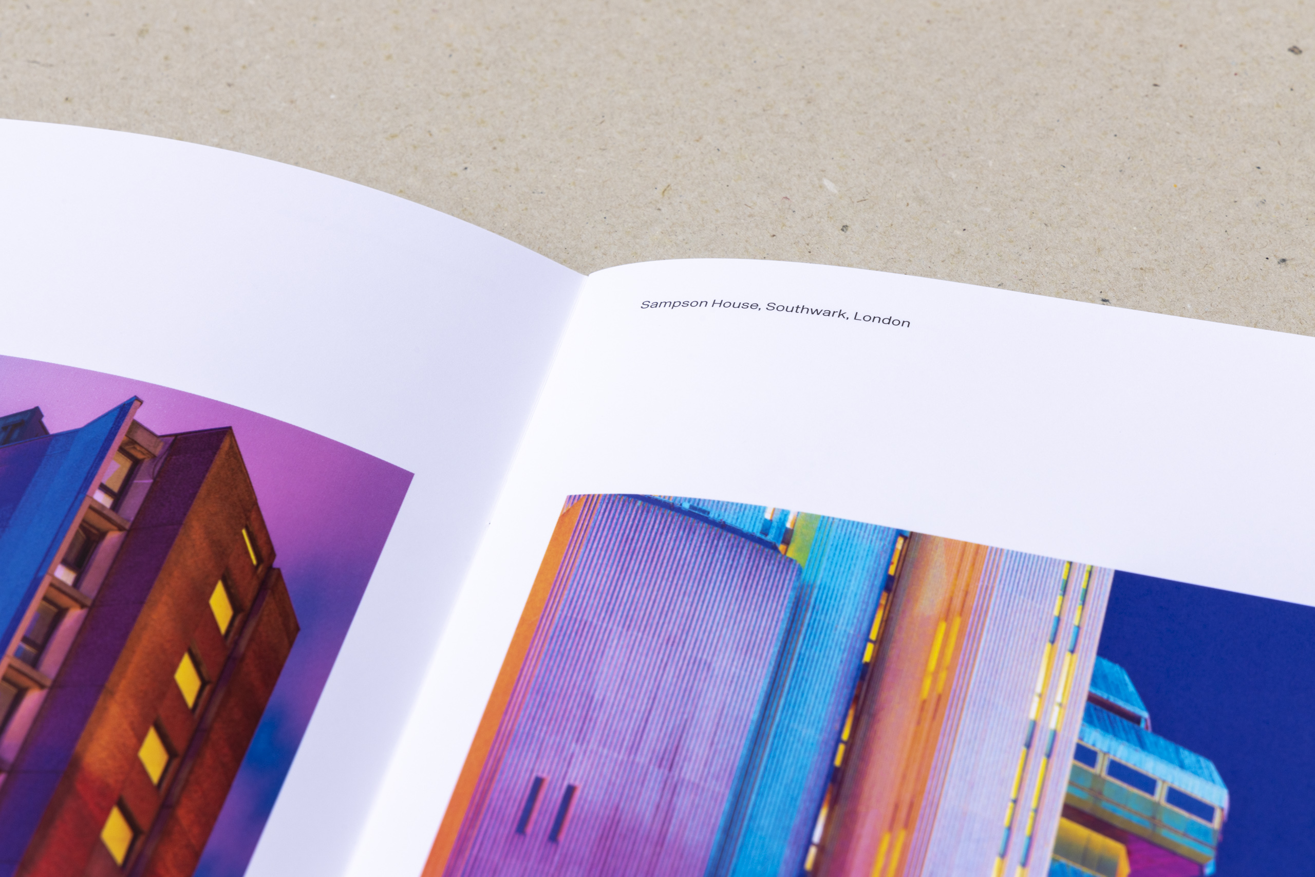
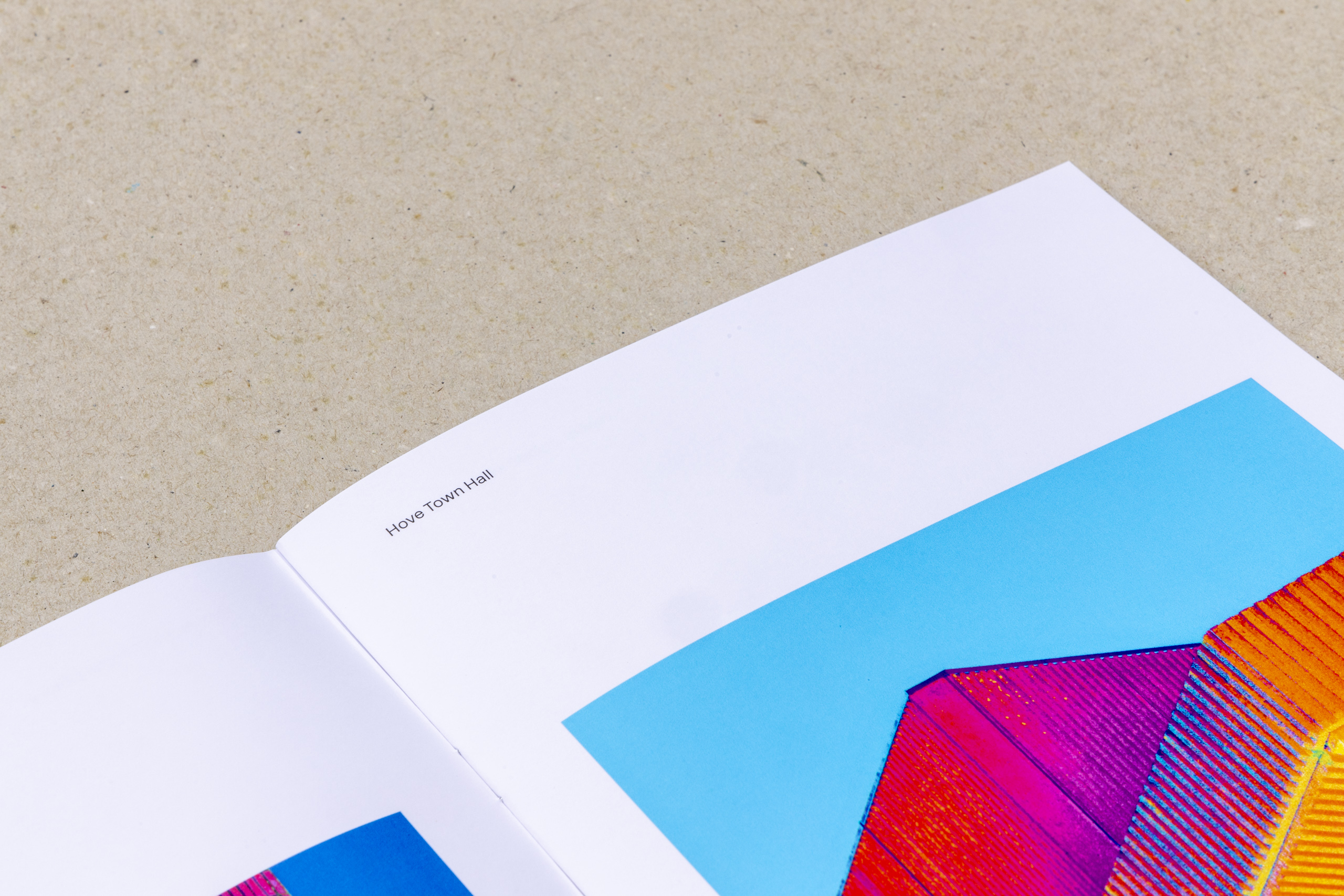
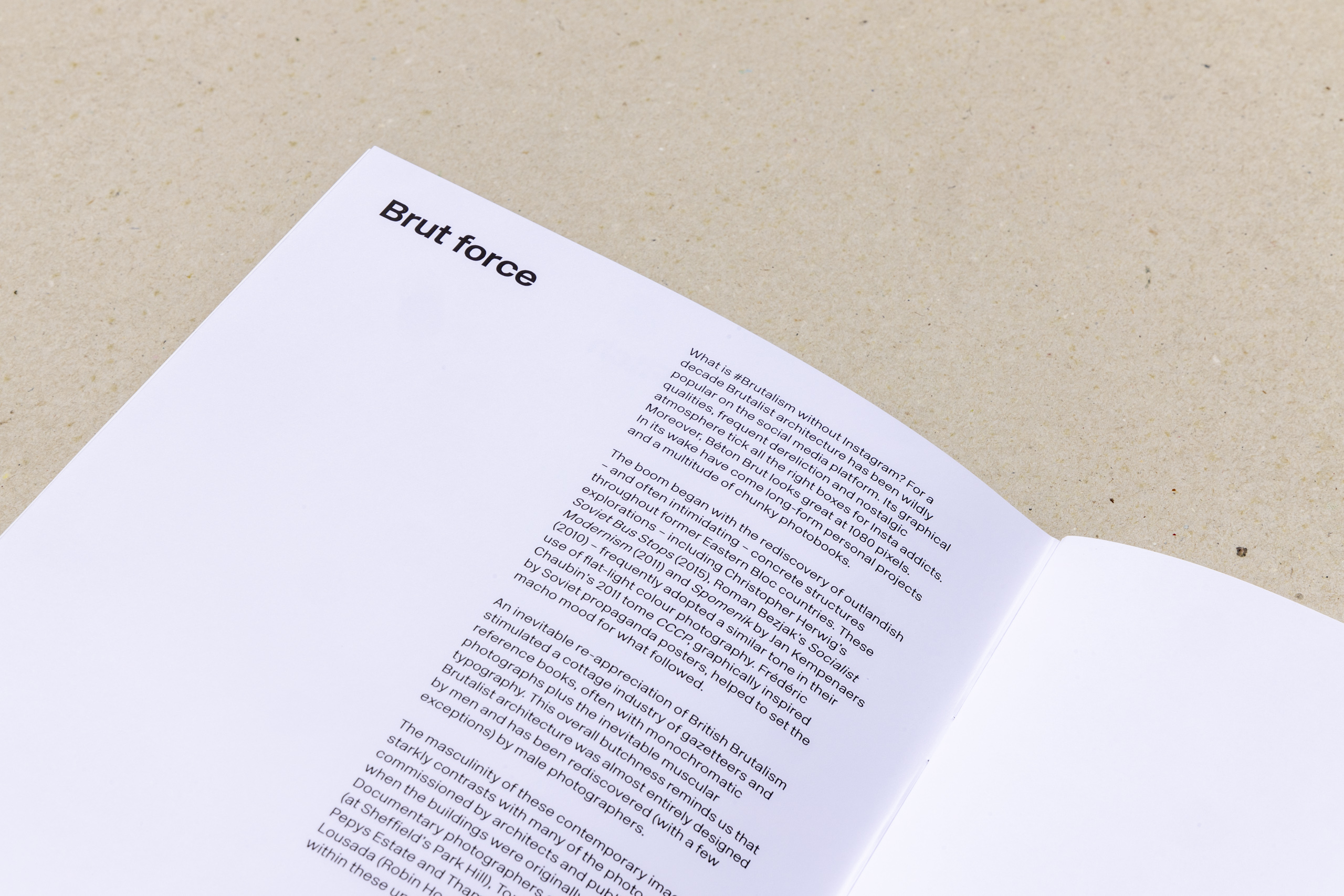
Brutalism in Colour is a long-term personal project by Christopher Hope-Fitch. The series documents Brutalist architecture across the UK, created using very long exposures at night.
The vibrant colours are not added to the images, but are simply drawn out by manipulating the vast amount of information captured by the camera sensor during a long exposure. The colour variation comes from the different light sources striking the building, such as sodium street lights, or fluorescent and tungsten bulbs.
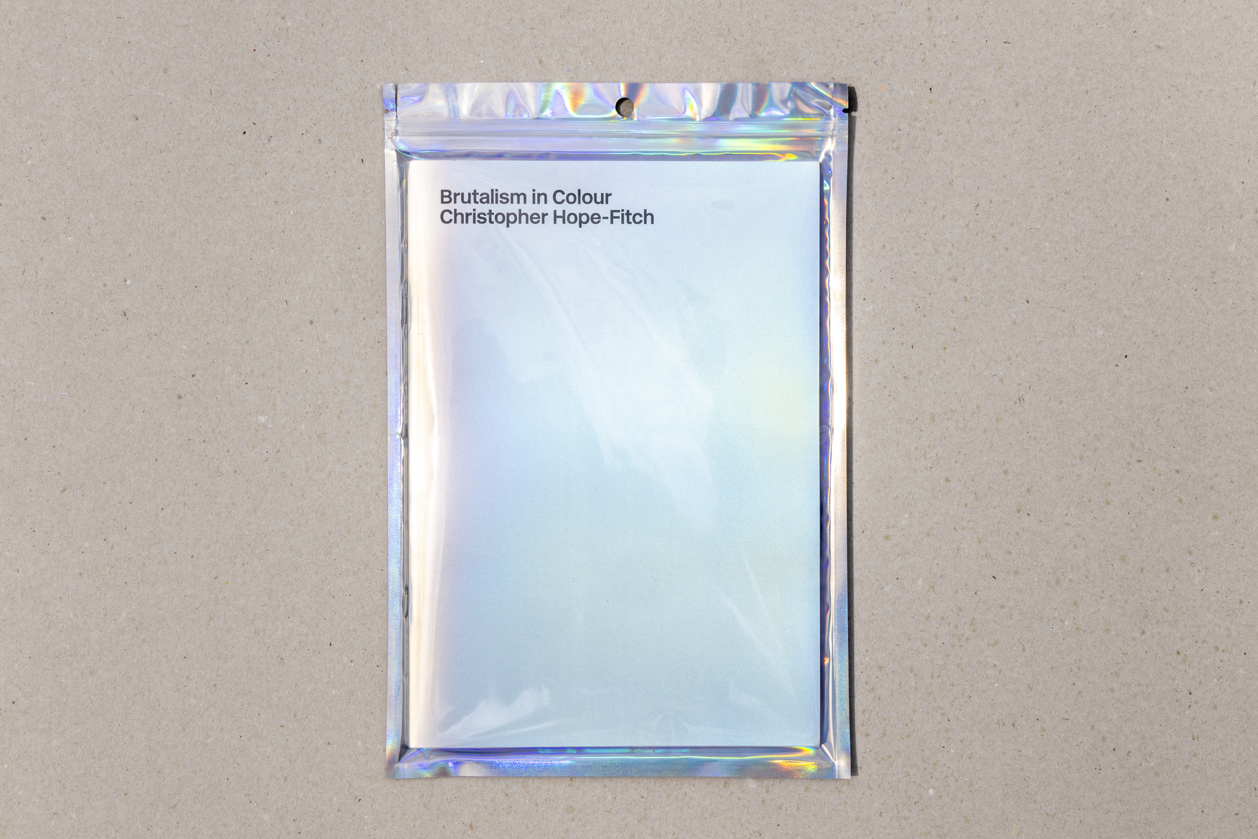
In June 2024 Christopher exhibited a selection of images (the total collection stands at over 400 and continues to grow) at Gareth Gardner Gallery in Deptford. I was delighted to design the accompanying book for the exhibition, which is B5 format, 48-pages and features some of the most striking photographs from the show. The design of the book is deliberately minimal, allowing the images to shine.
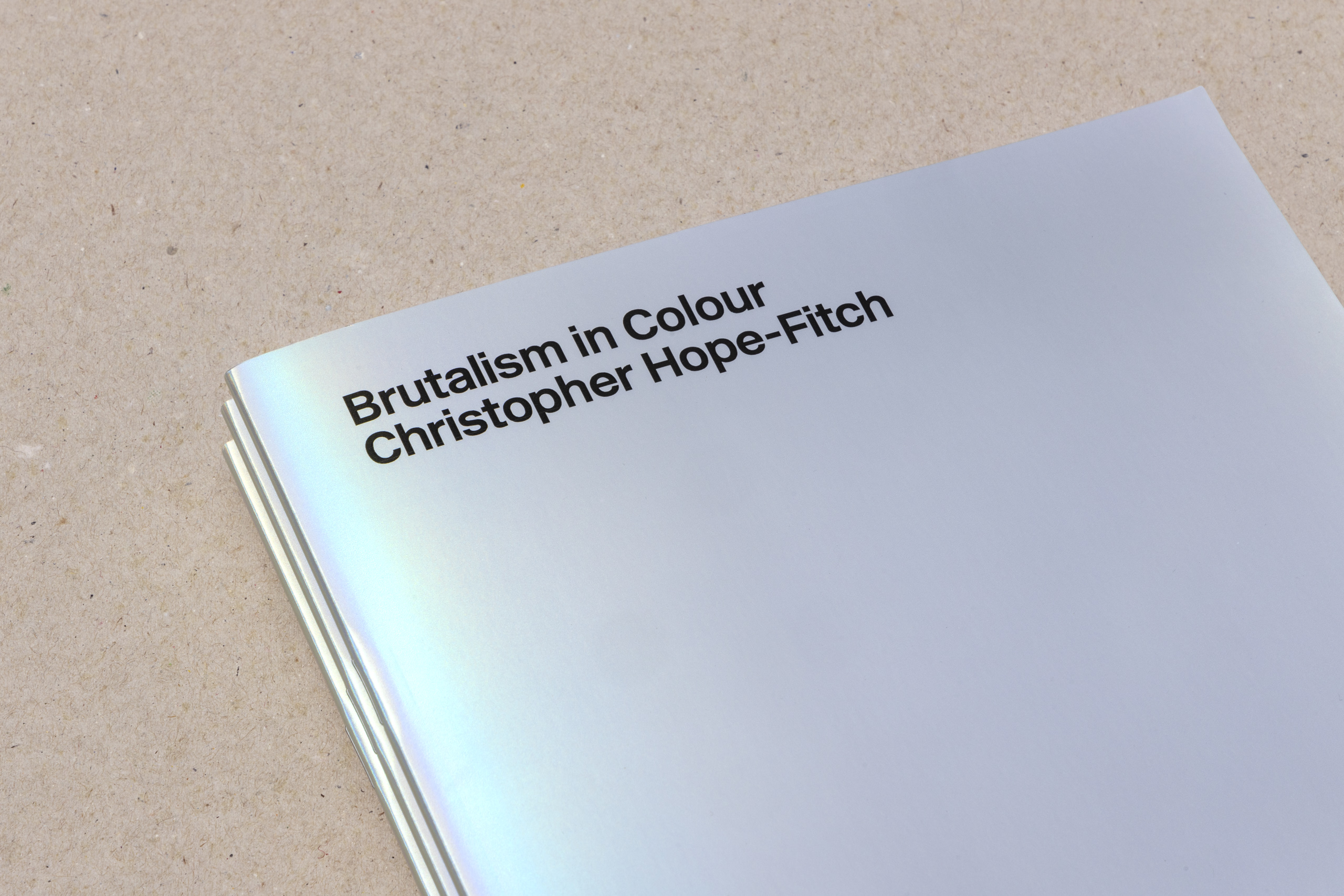
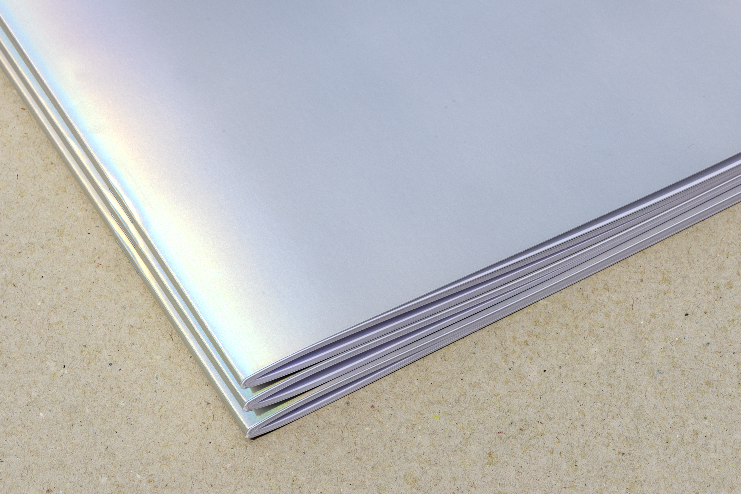
The cover was printed on a rainbow-effect paper stock, which looks silver at first glance but shimmers with red, green and blue as it reflects the light. The typography is set in New Rail Alphabet by A2 Type, nodding to the particularly British flavour of Modernism that the buildings embody.